Why Color Theory Matters More Than You Realize in Portrait Photography
- Feb 9
- 2 min read
This guest blog is written by Heather Cheatham, owner of Visions by Heather Photography
When most people think about what makes a beautiful portrait, they focus on expression, posing, or location. But there’s another element quietly shaping how an image feels -color.
Color influences mood, balance, and how the eye moves through a photograph. When it’s intentional, portraits feel cohesive and timeless. When it’s not, something can feel “off,” even if everything else seems right.Professional photographers are trained tounderstand how color works together and how those choices impact the final image.
A Simple Look at Color Theory
At its core, color theory is the study of how colors interact and how those interactions affect perception. In portrait photography, this understanding helps photographers create images that feel balanced rather than busy.
Some of the most commonly used color relationships include:
Monochromatic color harmony
This approach uses variations of a single color -lighter and darker tones of the same hue. Monochromatic palettes tend to feel calm, clean, and emotionally soft, making them ideal for timeless portraits.
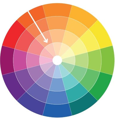

Analogous color harmony
Analogous colors sit next to each other on the color wheel, such as soft greens and blues or warm yellows and oranges. These combinations are naturally pleasing because they’re often found in nature, creating images that feel organic and balanced.


Complementary color harmony
Complementary colors sit opposite each other on the color wheel and create strong contrast. When used intentionally, they can add energy and visual impact but they require experience to balance so the subject remains the focus.


Understanding these relationships allows photographers to choose colors that support the subject instead of competing for attention.
Why Color Decisions Start Before the Session
One of the biggest misconceptions about photography is that color can be “fixed later.” In reality, the strongest images are created when color is considered during planning -from wardrobe to location to background.
An experienced photographer guides clients toward clothing and settings that work together, taking into account personality, energy, and the desired mood of the portraits.
What This Means for You as a Client
You don’t need to know the color wheel to benefit from color theory. That’s the photographer’s job.
When you work with a trained professional, you’re working with someone who understands how color influences the final image and who makes intentional choices so you don’t have to guess.
The result is portraits that feel polished, cohesive, and thoughtfully curated.
The Difference Expertise Makes
Beautiful portraits aren’t created by chance. They’re shaped by hundreds of small decisions, including color, made with purpose.
Photographers who understand color theory bring clarity, confidence, and consistency to their work. And while clients may not always be able to name why an image feels right, they can absolutely feel the difference.
That expertise is what turns a photo into a portrait worth keeping.
***** Planning a visit to Central Virginia? Get in touch with Heather to book a photoshoot for your senior or your family and put her expertise to use for your own portraits!